The terrible truth about the project

Here's what the patient looked like before contact us. This is a screenshot of the website russianhouse.info from the 2018 web archive.

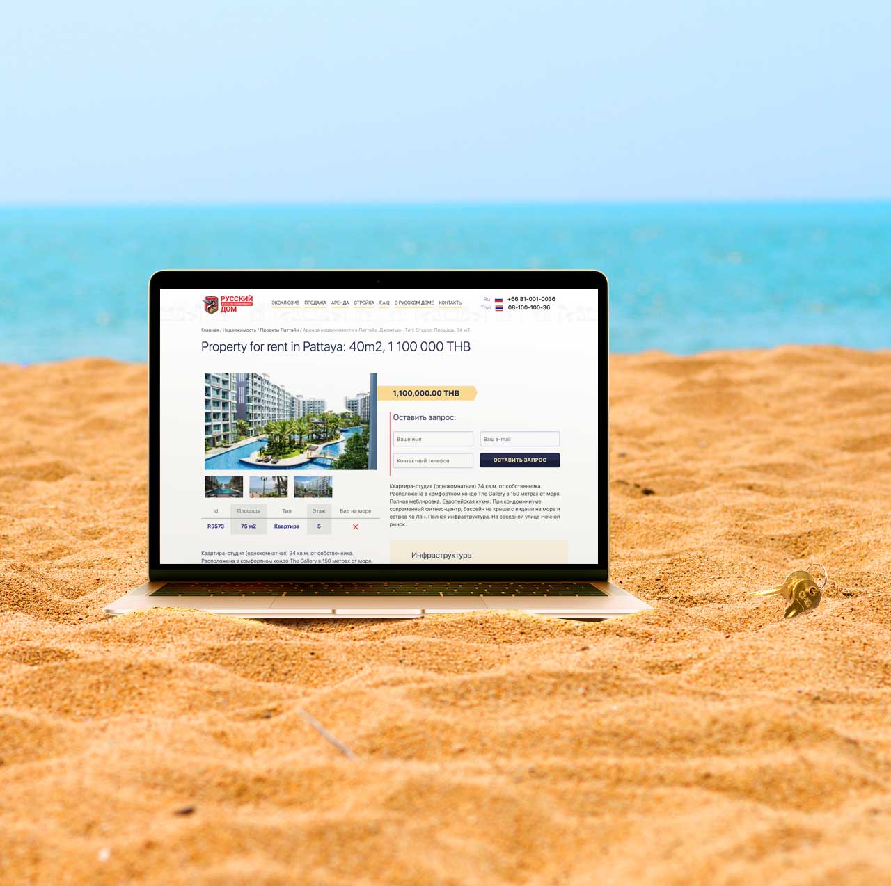
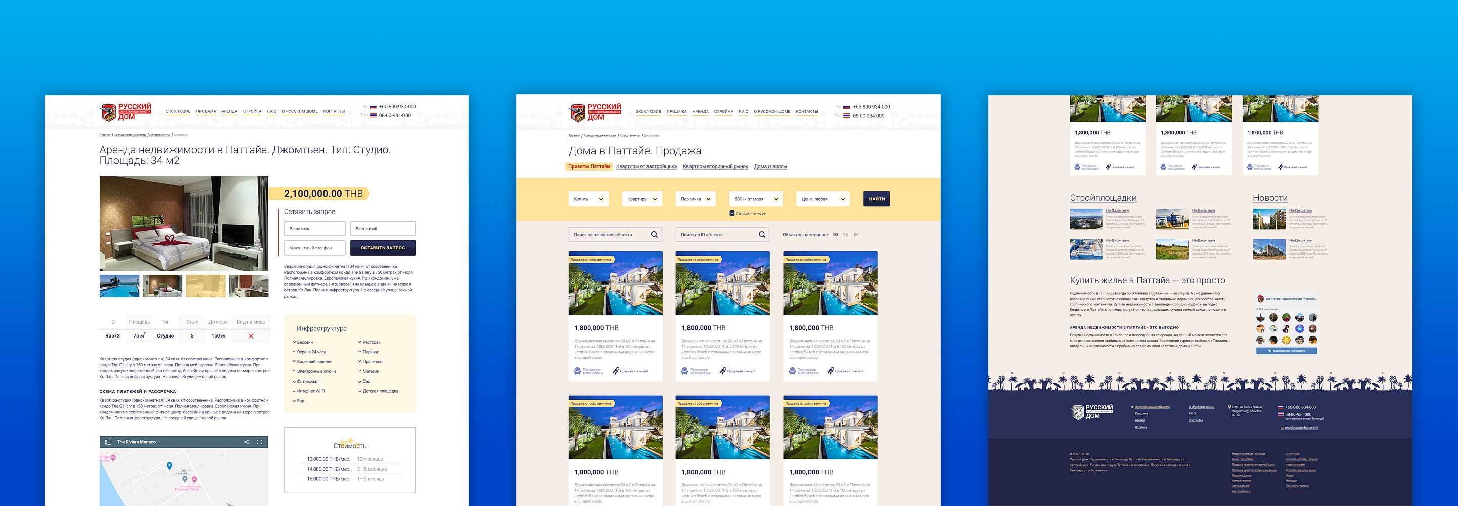
We completely redesigned the site s design and style. All that remains is the logo: unfortunately, it was impossible to change it. The screenshot shows a new, convenient view of the real estate catalog.

The most important page: object card. It is on it that the visitor may decide to leave a request, it should be as convenient and informative as possible.

Display Google maps and options for the cost of the object. The management system has the ability to create two types of cards: for rent and for the sale of real estate. Prices are displayed differently in these cases.

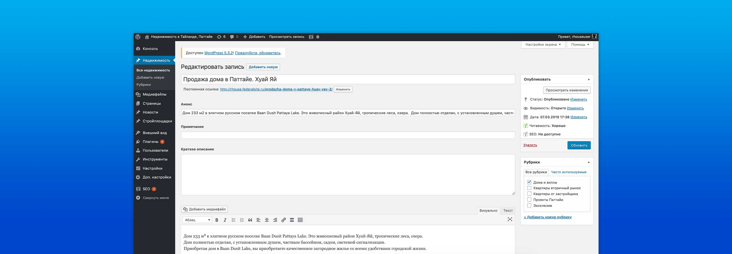
Screenshot from the site admin panel. Entering an object has become simple and convenient: through an intuitive interface, any manager of the Russian House real estate agency can now create a new object card in a few minutes.

The site worked on the old self-written control system. When it became clear to the client that the programmer had disappeared and there was no one else to support the site, the company turned to us. In addition to the visual redesign, we carried out a migration (site transfer) to WordPress CMS and transferred all the information so that the client s site didn t slip in the search results of Yandex and Google.

