We expose the truth about the women's clothing store
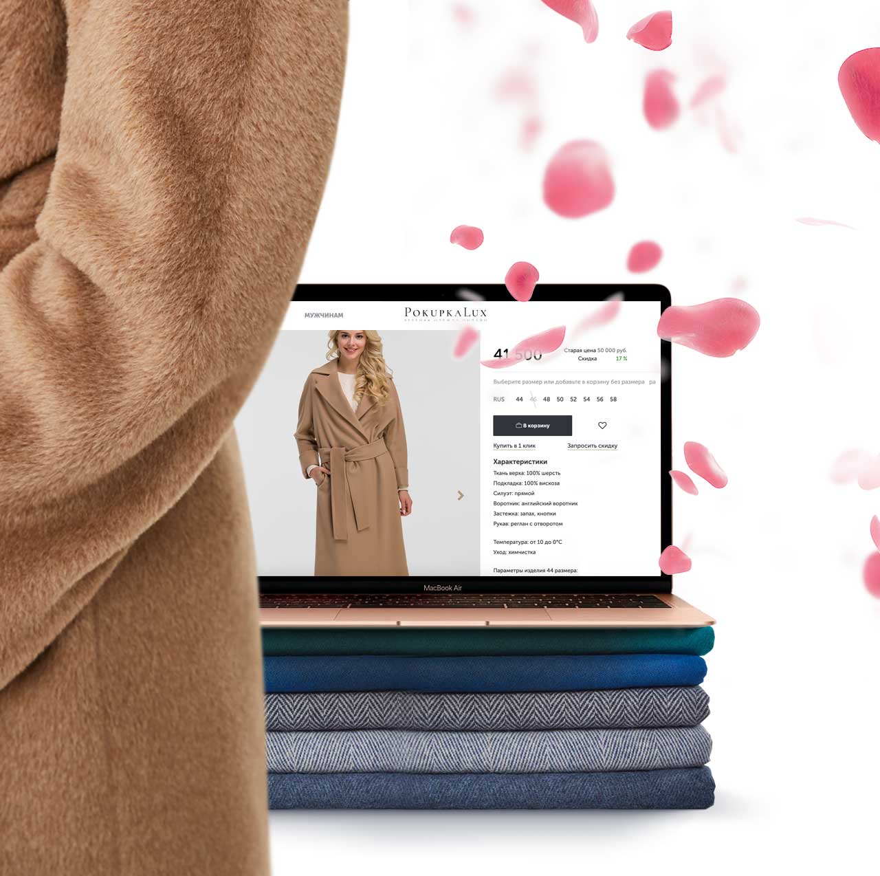
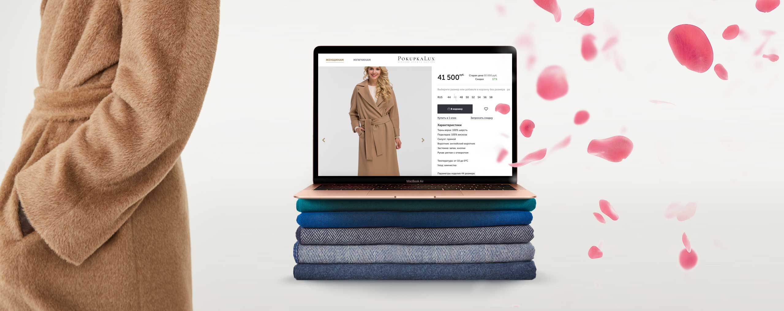
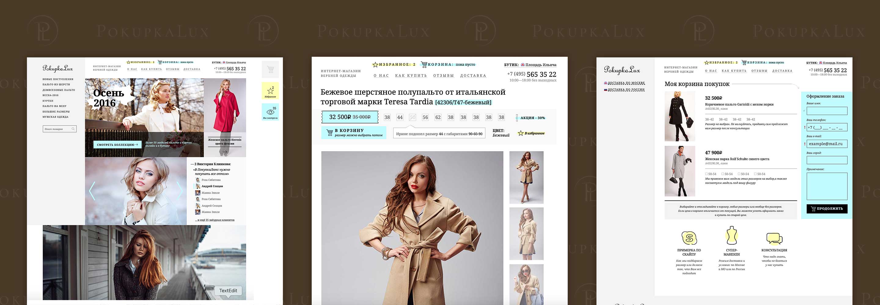
Here are just a few of the pages that we worked on (this is a static layout, links inside are inactive):
- Home
- Product card
- Catalog
- About the store
- Order basket
- How to take measurements (for women)
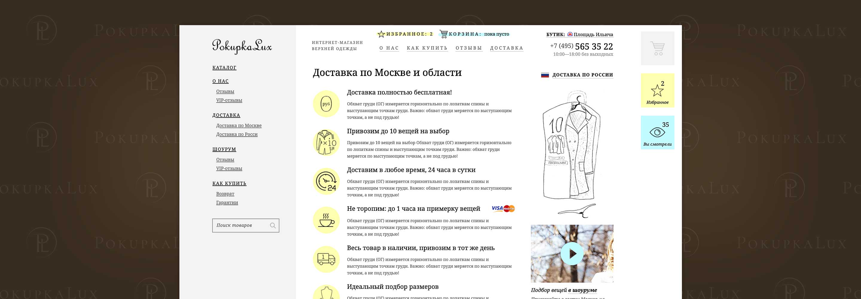
- Delivery (Moscow)
- Delivery (Russia)
- Information page
- How to buy
- Reviews
- Sizing
- Showroom

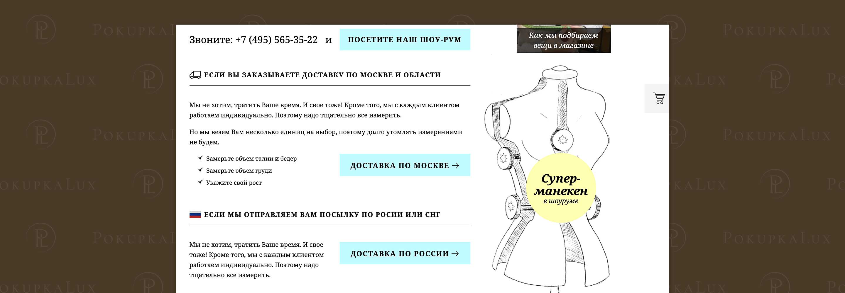
Women are well aware that the choice of size is a real head pain BuyingLux has its own technology for remote sizing, and about it we made a separate page on the site.

When working on the main page, we made the client < a href = "/static/img/content/portfolio/old/pokupkalux_mcocos.pdf" target = "blank"> here is such a presentation of the concept , where they substantiated their stylistic decision. The client, however, eventually chose a "light" theme instead of our "dark" :)

For the online store we have created our own corporate set of contour icons.

Workflow: outline future icons for Internet the store.

A bit about marketing. For the online store, the most important part of the marketing packaging is customer reviews. Of course, feedback on third-party resources is important; but on the online store itself you need to use them to the maximum. Several types of reviews were organized in Pokupelux Suite: audio reviews, video, written. Of course, we built them into the site in such a way as to constantly increase the confidence of visitors and, therefore, the probability of a purchase.
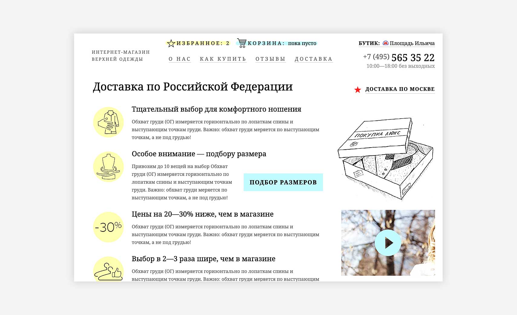
On the "Delivery in Russia" page, all are removed questions arising in the head of the buyer. How not to make a mistake with the size? When will they bring it? Is it more profitable than looking for a product in your city?

Fast forward to the time machine in March 2016, to see what condition the site was in before contacting us. By the way, in this project we worked only with design and HTML-layout: the online store worked on a heavily "dopped" version of 1C-Bitrix, and the in-house programmer took up the design.

Calligraphy for one of the logo versions. About this - in a separate case .

Illustrations for the site: an interactive make-up, using which is a remote selection of sizes, and a box for the delivery of things.

